
No, your other left.
Good.
There is a high probability that you can see something right now that was conceived by a graphic design artist. Maybe it is a neato poster you have on your wall like this one I have. Maybe it is a coaster for a drink with a family crest on it, maybe it is your mousepad. Even if you are a nihilist and everything around you is gray and boring I guarantee that you can see at least one piece of graphic design right now. The logo for your computer. Even just the word "MacBook" counts as graphic design. Some Apple employee put a lot of thought into deciding the font for that logo. My point is, pretty much everything you see has a graphic design artist's mark on it.
The term "graphic design artist" is basically a cool way of designating somebody who creates images to communicate visually, which is pretty generalized. Straight from the source of all human knowledge (AKA Wikipedia) "From road signs to technical schematics, from interoffice memorandums to reference manuals, graphic design enhances transfer of knowledge."
In anticipation of this post I did a small redesign of my blog banner at the top. Expect it to change periodically as my whim shifts.
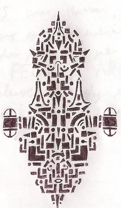
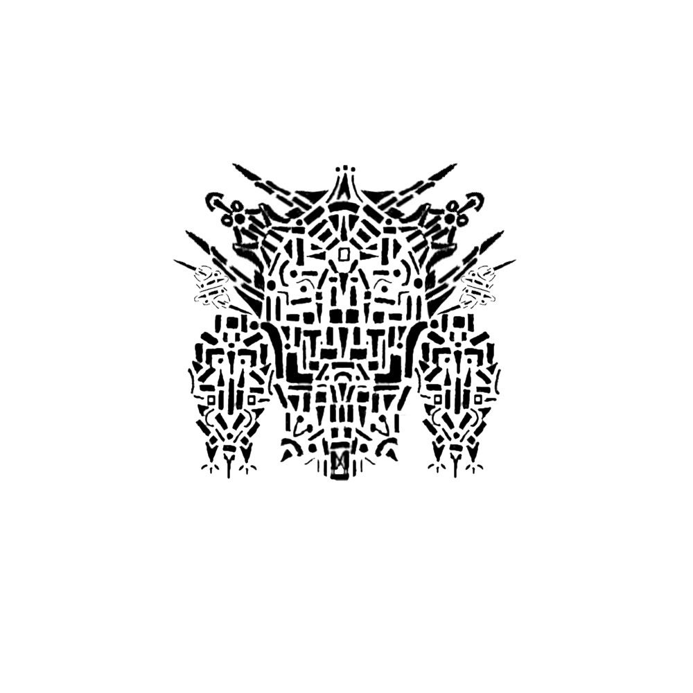
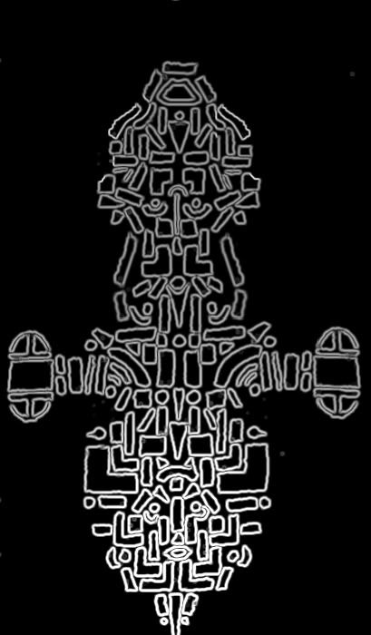
 I consider myself to be an amateur graphic artist and I've been working with graphic design in one form or another since middle school. If you've been keeping up with my blog you've already seen One of my favorite things to do is to create patterns of of small geometric shapes like this one using a nice deep black pen. Then I scan them into my computer and digitally enhance them. This is the more basic type of graphic design I do. In this particular case I altered the original design to look like Serenity from Firefly. When I first start my doodles I never really have anything in mind, but most people tell me that they either end up looking like a castle, bug, or spaceship. I just put down the shapes that make sense to me.
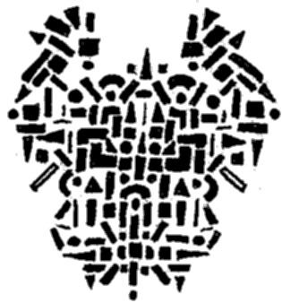
My first real foray into the world of digital graphic design was a few years ago when I decided to make backgrounds for some poems I had written for my creative writing class. While I make no claims to my prose-prowess I am quite happy with the way the backgrounds came out. I'll walk you through the process I followed in order to create the background for my poem "The Imperial Order." Bonus points if you get that reference without using Google. My method for creating the backgrounds was as follows. (click on images for larger versions)
1. Come up with an idea for the design.
This involves planning around the content of the poem itself. The design can't be too busy or the poem will become lost in the background. Typography is a big part of the design. I decided upon a dim, misty army approaching a castle wall with big, looming mountains in the background.
 2. Get component images.
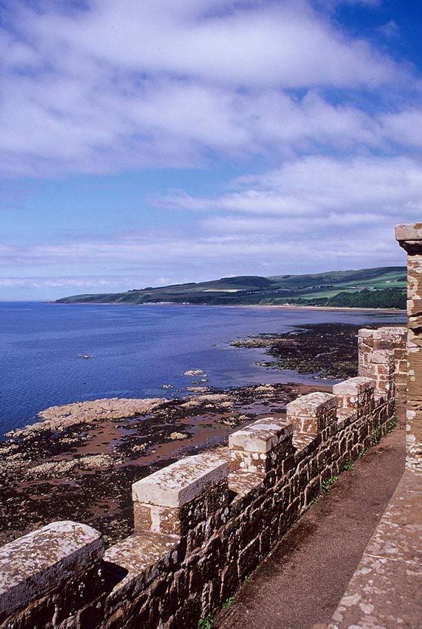
Due to my inability at the time to produce the images I wanted myself, I then proceeded to search the internet for photos and pictures that I could use to create the different elements of my image. I knew I wanted the viewpoint to be from atop a crenelated wall so I spent about an hour searching for the perfect image. If I were a professional I would probably call up my photography buddies and have whichever one was nearest a castle get exactly the shot I wanted. Lacking that, I found this shot of some battlements at Culzean Castle in Scotland, which fit the bill of what I wanted. The next step was removing the ocean view and replacing it with my other images. Those other images included the army, the mountains and the sky.
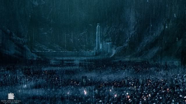
For the army I spent a long time searching for something that might work. In the end I decided that this scene from The Lord of the Rings was my best bet. The army was indistinguishable as individual troops but you could still tell it was an army. The army was also far away enough to sell the illusion of being high atop a castle wall.
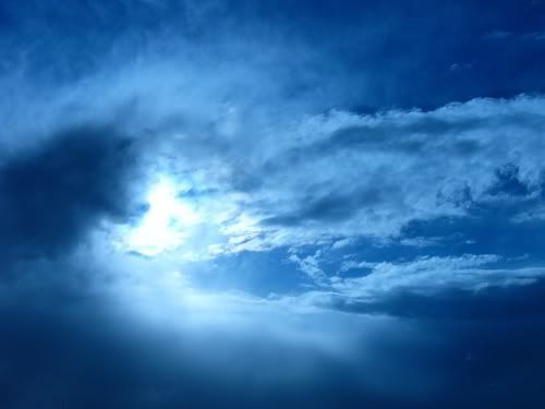
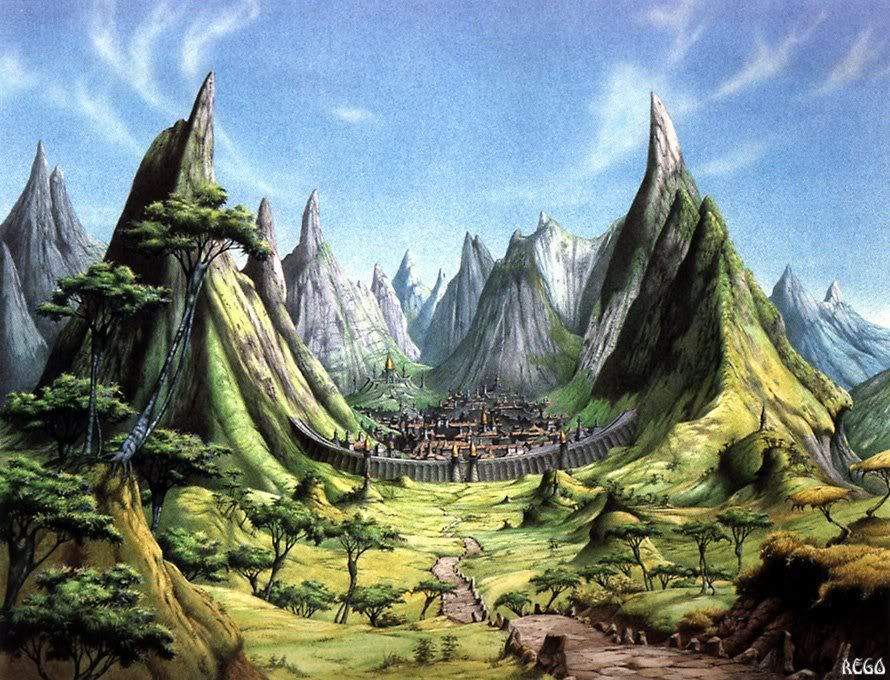 The mountains were even trickier. I had to find something that would work in the background, fit in the confines of the image, and portray the looming eerieness that I was looking for. If it had been possible I would have definitely made the elements myself as it would save time in the end. Finally I came across an image I thought I could alter sufficently well enough to work. The mountains didn't really look evil in the original picture, and I nicknamed them the "Happy Gnome Mountains" cause I thought the village in the valley looked like a place you'd find gnomes. Don't ask, I really don't know. Once I'd found these three major elements I set about to creating the composition. What about the sky, you ask? Well, the sky didn't actually occur to me until later. Graphic Design (at least in my experience) involves just as much (if not more) on-the-fly alterations as planning.
3. Choose your editing program.
You are probably familiar with at least the name of the program Photoshop, or Adobe Photoshop. As the industry standard it is used by professionals across the world and by many amateurs looking to give their products the extra edge in quality. Unfortunately Photoshop can cost up to $800. There are many student discounts and such but even with these it can be expensive for those just starting out. Alternatively, you can look for a free product. There are many options out there including Picasa, Photoscape, Picnik, and Paint.net. These all allow the user to perform basic to moderate alterations to their images. I haven't used them all but I do use Picasa for organizing photos. None of these programs give the editing capability of Photoshop, but they are very nice for being free.
The best free image-editing software you can get, in my opinion, is GIMP, formerly known as The GIMP. GIMP allows you to manipulate images in much the same way as Photoshop minus a few of the high-end features. Which, unless you are an uber-pro, you don't need anyways. I discovered GIMP in my Freshman year and I've been using it exclusively ever since. I've tried out Photoshop but GIMP is easier to use and completes all of the functions I want it to. I highly recommend it to anybody interested in spicing up thier images. I'd put a picture of the GIMP workspace up but these school laptops are incapable of having GIMP (or anything else) installed.
 4. Start composing your image.
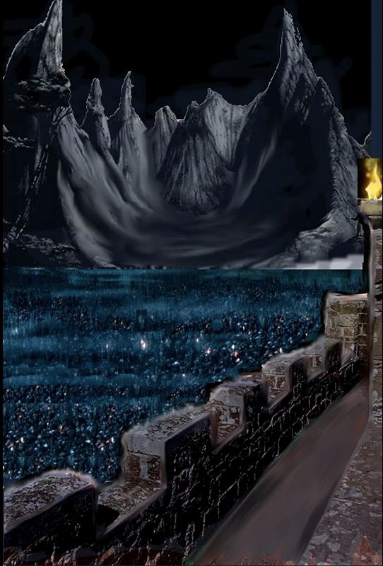
 Start resizing, rotating, and cropping your component images until you have the basics meshed together. Here is an image of the Imperial Order background in the early stages. I've actually done quite a bit of editing at this point. You can see that I've cropped out the ocean from the wall and messed around a bit with the walkway, blurred the village into fog, and expanded the army to fill the space. I've also added a fire element to make the scene feel more night-like. It was at this point I realized I needed a sky.
5. Remember to save a separate copy before making major changes.
A lot of the time you'll find that some alteration you've made is horribly wrong for the overall composition. If you're lucky you can just hit ctrl-z a couple times and fix it. But sometimes you have to backtrack beyond the last time you opened your file. It is always a good idea to save the image every couple of steps under a new filename. Not only does this allow you to go back if you find something wrong, it lets you put together a blog post like this where you can see progress over time. :-)
6. Blend your images into one.
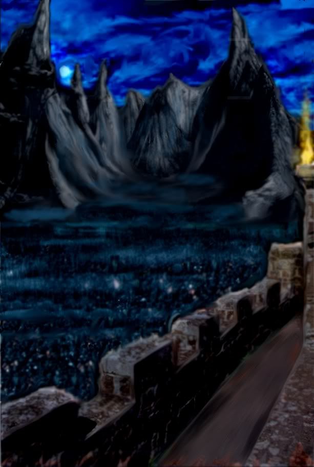
This image was a bit easier to mesh together than some others I've done because it was set at night so I could just blur and darken everything then add a similar hue to the whole image. The clone, blur, smudge, and cut tools are your best friends during this step. Make sure if you are planning to have text that you try some different fonts and colors here to see what works best. If you want to see the composition a little further along than the last picture, click here.
7. Add any minor tweaks you want and start focusing on the little details.
This is the home stretch. It can be the easiest part or the hardest part depending on how OCD you've been earlier on. If you have any typography, now is the time to finalize it as part of the image instead of just another layer.
8. Save your image in a high-quality format.
Nobody likes a blocky image. Unless you are afraid your work is shoddy and you don't want anyone looking closely at it save the image at the highest quality settings you can.
9. Sit back and enjoy your work.
Look at it closely, make sure nothing is amiss, and you're done.
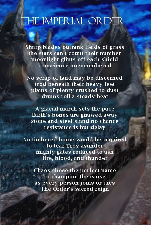
Here is the final result for my project both with and without the poem itself. (click for larger image)
As this is the longest blog post I've ever written I think it deserves something special. A contest!
Now you can go make your own! If you submit your own graphically designed image to me at sirobproductions@gmail.com I'll pick out the best one and you could win FABULOUS PRIZES! Well, maybe not fabulous, but I'll come up with something. Since graphic design can mean almost anything I'll accept almost anything as an entry. If you use images from the web, please include their sources. I don't expect to have more than maybe 3 entries, so you have a good chance to win if you enter.
I hope you all have enjoyed this post as much as I have. Please feel free to comment!
DISCLAIMER: All images on my blog, especially in this post, are the sole properties of their respective owners. I sincerely apologize for not giving proper credit in all cases but copyright infringement wasn't on my mind when I designed the poems years ago so I didn't write down the sources. I never thought I'd put these out in public. If you are the owner of one of these images and would like your image removed, please let me know.
No comments:
Post a Comment